Wednesday 10 June 2015

Final Pitch Evaluation

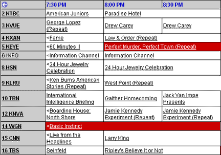
My client was the prestigious and widely circulated Bath Chronicle newspaper. With its head office located in the centre of the richly historic city of Bath, the cater for the news needs of those who live locally nearby or even as far as Wales.


Earlier this year they came to my college seeking ideas on how they could retain their younger readers. So I was tasked with a project on finding out how they could to this.
My idea was to create a personalised web service that suggested to account holders, videos that were cross platform and exclusive to the internet.


Five Weaknesses of my Final Design
  • Difficult to Learn
  • Hard to Navigate
  • Unappealing Text (Font, Colour, etc)
  • Too Much Wasted Space
  • Slow Responses


Five Strengths of my Final Design
  • Visually Appealing
  • Enjoyable to Browse
  • Lots of Pictures & Videos
  • Original Concept and Design
  • Innovative Graphic User Interface


The theme for my design was based upon real life index cards. I wanted each webpage to be a separate card which gets layered on top of the next one as you delve deeper into the website. And as you go back to the homepage you slide off each card layer by layer.

Each webpage is about the dimensions of an index card and is based an the action of piling index cards one on top of the other. This helps give the website feel 'quick and easy' to use as each page is minimal in text and just has the important information.


The scrolling concept was based off the parallax scrolling effect, as demonstrated here:

First the extreme background is chosen.
Then, the middle ground.
Next we make a foreground.
Once we have those three basic layers they can be linked and set to different simultaneous scrolling speeds, giving it an illusion so 3D depth on a 2D medium. 

I was also inspired by this website for the movie, Life of Pi, which has been voted one of the best parallax websites of all time.


There were countless experiments and explorations conducted throughout the production process of my website tour. I tried using different colour palettes for the websites. Originally going for a chalky grey with a hint of turquoise, but the opting to use a pitch black background as it was able to compliment virtually every webpage, while still keep a dark, cinema-like mood to the website. 

I also tried various font style, for example serif and sans serif fonts, different font sizes, thicknesses, colours, features, etc. In the end I decided to go with a modern and bold font. So for this I used a tall sans serif font with medium thickness, crisp edges and contrasting colours (depending on the background they're on). I made sure to use this same font style all throughout the website to keep the continuity and branding consistent.

As regards the navigation of the website, I did try making it simply scroll up and down like a traditional website, but after a focus group and hours of thinking came to the conclusion that it worked better with the parallax scrolling.


Above is an image containing all the 'cards' in my website concept. Below is a screenshot from the Netflix.com website, the closest thing I can compare my work to.
One noticeable difference is that on the Netflix website it using the reoccurring design of little movie posters that act as icons. When hovered over it gives a brief description description of the film and when clicked automatically plays the video. It does this as far as you scroll down for every single featured video. On the other hand with my website each page has a different layout, sometimes showing movie posters, other times screenshots or a banner. Which helps to keep things interesting as Netflix's design can get very repetitive and boring, very quickly.

I do however like how a dialog box opens up with the movie description when hovered over instead of taking you to another page with information, as my website does. I think Netflix's idea is a lot quicker and straightforward. 

My design uses more images and full-page banners to feature content, which I think is a strength of my website. This is far more visually appealing as opposed to Netflix's basic design which occasionally has one banner. 

Netflix's website also has the bare minimum amount of text, hardly any actually. It mainly comprises of movie poster icons. In comparison my design is more text heavy. Although I do not find it has a lot of text, it definitely has more than Netflix.

Both designs however are very visual based and make surfing through the website enjoyable for the user. They also suggest content that is personally tailored to each user. As well as give brief synopsises of videos and allow users to rate and share them.


Ideas are all well and good on paper, but actually trying to make my ideas become a working product is a very difficult task, riddled with obstacles. For example, as the website is heavily based upon the concept of layers, making sure everything was arranged correctly, from each card, picture, text box, and cursor was far more difficult and time consuming than I thought it would be! 

Also, just before the deadline I showed my Digital Publishing tutor my final major project product, and he pointed out quite a few changes that I had to make. Although I felt like it was a complete contradiction to my artistic vision I did realise that it needed to be branded to the Chronicle's website more. That's when I had the idea to drop the Flash file I had already finished by then on to a screenshot frame of the Bath Chronicle's website, with a hole masked out in the middle where the video would be played. As the video had to be at the back due to its odd dimensions, the website frame in the middle ground and the mouse cursor to the front. Although this was a long and arduous process I'm so glad I did it. As I think it really made it look like it could belong to the Bath Chronicle and had I not listened to my tutor, I think my pitch could of gone very differently.

Also, I created the website tour and then at the last minute placed it into a mask of the Bath Chronicle's website. The idea of doing so seemed very straight forward but in actuality, it took me three and a half hours to get it perfect! I even had to ask my Interactive Tutor Steve to help me out, and even he was stumped! All over a simple but unsolvable problem of my video not being able to be centred in the mask frame. Eventually we worked out that it was an apparent glitch in the software and were able to correct it. We did this by turning on the onion skinning option, then selecting every single frame then selecting the multi-frame selection button.

These obstacles along with a few others caused my idea to transform into something different, however slight, than I originally planned. But I do not think that it made it worse, rather I was forced to find a way to turn it into a positive outcome. Best of all, I was able to accomplish everything I set out to do which was make design an attractive yet functional web video guide.


Although Ed and Lynn really liked my pitch idea, it was unanimously agreed that my concept would cost far more money than the Bath Chronicle can offer, with my website costing thousands of pounds to create and maintain. If money wasn’t an object though, they loved it and would back it which is good enough for me and made me feel relieved and proud of myself. Lynn thought the design of the website was gorgeous and intriguing. She had never seen anything like it and agrees it's something that the target market would use. She also liked how I integrated it into the Bath Chronicle's website. I just need to find a company that could produce my website idea!

Lynn, the Head Editor of Bath Chronicle, suggested that I come up with a weekly print/digital article that suggests video from various themes or categories for the targeted demographic. That way it’s semi personalised and far, far cheaper! That way they would be able to fund it, as the cost to develop and maintain the website was the biggest issue, and in the end the negative deciding factor as to whether they take onboard the idea or not.

I would say that my final work was appropriate for the client, they really liked it! The only problem was the cost issue. It would be just far more than they could afford to fund. But if money weren't an object then it would be able to fulfil all their needs. It is something that those in the target demographic (14-25 year olds in ABC1 households around Bath) would need and enjoying using, and rely on the Bath Chronicle for. As regards my product sufficiently answering the brief, it does so to in every way required. I made sure of this each step of the way and have regularly gotten my tutors and classmates to assess my work to make sure I'm on the right track.

I was extremely nervous and let them know this before my pitch but they reassured me that there’s nothing to be nervous about. And they were right, it was very easy, simple and short! I was done in no time really and now I feel so relieved that it’s all over. I spent the previous two weeks rehearsing over and over again. Before the actual pitch I was practicing some confidence exercises. I had to do all of this because I am an extremely anxious person and worry myself sick unless I constantly keep busy practicing.

I was quite proud of the actual Keynote presentation I put together for my pitch. I was able to keep the wording down to an absolute minimum, and stuck to use 'trigger words' rather the reading out from a script. I also took into consideration the clients as my audience and made sure that they would be able to understand the information on the projector screen.

When my pitch started I lost virtually all my nerves and just focused on staying as natural and confident about myself, and my product as possible. This seamed to work and both Lynn and Ed said that my nerves did not show! It went far better than I expected. Mainly because I always imagine and focus on the worse case scenario, which was me forgetting everything I had to say, going over time and fainting! Neither of those things happened so I'm very pleased with myself. I was able to make my client and tutor laugh, I engaged them and kept their attention for the duration of my pitch.

To improve next time, I want to have some kind of tangible handout to give to the clients. I think this would really help in engaging them more into the presentation by having something they can actually touch, feel and examine. I also would like to be more energetic. By nature this is not a personality trait I find easy to adopt but if I could learn to be livelier while giving a presentation like that, I think I'll better be able to keep them interested and excited.

Monday 1 June 2015

Quick Pitch Reflection

Today we were assigned to create a presentation on a random topic that was selected for us.

I was given 'The City of Bath', despite being considerably late to the class I was able to get a presentation done fairly quickly. 


Areas I Did Well In (as brought out by my tutor and classmates):
  • Confidence
  • Naturalness
  • Eye-Contact
  • Gestures


Areas I need Improvement In (as brought out by my tutor and classmates):
  • Don't say what I don't know
  • Don't fiddle with my hands, keep them behind your back if needed


Tuesday 19 May 2015

Product Changes

I showed my Digital Publishing tutor my final major project product, and he pointed out quite a few changes that I had to make. Although I feel like it is a complete objection to my artistic vision I do realise that it need to be branded to the Chronicle's website more.

Before this was what my product looked like:

Then I added this mask of the Bath Chronicle on top of my existing Flash document.

It definitely looks like it's branded by the Bath Chronicle now!

Thursday 14 May 2015

Website Production


Final Product

Youth Media Consumption

What media the Youth around Bath consume, as sourced from yougov.co.uk and interviews with my contemporaries. 

Apps
Snapchat
Whatsapp
Instagram
Clash of Clans
Facebook
Messanger
Twitter
Spotify

Movies
Avengers
Iron Man
Captain America
Sherlock
Hunger Games
Divergent

TV Shows
Top Gear
Sherlock
Gogglebox
I'm a Celebrity!
X Factors
Britain's Got Talent

Magazines
Top Gear
Vogue
Teen Vogue
Cosmopolitan
OK
Empire
Hello

Radio
BBC Radio 1
KISS 101
Heart
Capitol FM
Breeze


Product Reviews

I pitched my website concept today to some of my peers and here's what they had to say:


Abbie

Your tour is amazing! Extremely well made and everything is very clear. It's a really good idea. I like that it has nothing to do with Bath and is completely different from other people's ideas. I like the way everything moves smoothly and all the transitions are good. I think having the little taster video in there is also a really good idea. You have a variety of shows and movies there to appeal to everyone. I think the shows and movies that were shown in the tour would definitely appeal to your target audience. I don't really have anything you could improve on as I think it was very good. Well done!

Issy:
I really like your product, I think it is a really good idea. Considering our generations more interested in going online and using certain social networking sites and websites etc I think they would prefer to go online and to find things to watch instead of picking up a magazine and reading plus I like the idea of filling out some questions in order for the website to locate films that would interest each individual especially because sites such as NetFlix have so many films and programmes but if your website limits the amount to films similar to your interests they would be a lot easier to find.

Tom:
"Ite bled, ur idea was  well peng init, mans is well excited for when dey release it yeh."

Translation - "I really like the idea, I think it's something that a lot of people could benefit, not just people of Bath but people all over the world. My only concern would be how much it would cost for the upkeep of it to the Bath Chronicle who I imagine are probably quite tight with their budget..."


Sophie:
"That's really good James, it's an original idea with a lot of thought put into it, I think it could have a bit more to do with the chronicle though, I don't know how - it just could?"

Thursday 30 April 2015

Thursday 23 April 2015

First Pitch

Pitch Proposal

In the video embedded above I pitch my idea of two of my tutors, James and Steve. My idea is for a TV digest meets a TV guide, except it highlights only web based video content. What I like to call 'Internet Listings', for now at least. My original idea was to make it a print document that would make a weekly appearance in the Bath Chronicle newspaper, pooling in shows to feature from top video platforms such as Netflix, YouTube, Vimeo, Hulu, Vevo, etc.

Monday 13 April 2015

Internet Listings

From my primary research done on the aesthetics of TV listings, they serve little other purpose than wallpapering the universe with it's drab design. They range from bad to wrose as seen in the two pictures below. I never knew TV listings were so terribly designed!


It is here-forth my mission to design and produce an internet listing which is not only concise and easy to read, but enjoyable to read. Something I have not even been able to find of internet listings!


As the reflective posts on your blogs are currently a little under used I'd like you to start implementing a daily post with the following questions:
What I did today?
What were the main three elements that helped me develop?
What did I struggle with today?
Was there a ‘what happens if’ in my day?
Were there any eureka moments?
How can I improve on today - tonight or tomorrow?


Idea's Focus Group

Sophie:
"I think your ideas are very contemporary and useful for younger people. I think that you could maybe have something that is visually appealing like the comedians column is very vibrant and electric to attract people. I think the Online TV guide is a very original idea and could really work. The meal deal is a very good idea and would help a lot of people but would people just open the newspaper, take the coupons out and walk away? and I love the idea of a free app/song of the week, it is very good for young people and Apple/Android could also get benefits from it."

Vicki: 
"I think the first idea of having a free app/song would be appealing to the chosen demographic as I think it will be something they'd be interested in. And as it's worked to another popular company, I believe it would attract more younger people. Also I like the entertainment guide. because many students would be attracted to that kind of thing as it is popular in that age range."


What I got from the focus group conducted is that the free app/song of the week will be very successful and popular. So I will work on producing a presentation for it. But as it has already done by another company I will have to put an interesting twist on it to keep it fresh. 

What I will spend my time producing is a pitch for the Internet Guide/Listings. I envision this as being really trendy and modern, with a sleek and glossy graphic design, very typographically based. Pooling in listings from many different media outlets, such as Hulu, YouTube, Netflix, Pandora, iPlayer, Vimeo, etc. With quick, snappy and comprehensive write-ups for each featured video.


4 Ideas For The Bath Chronicle

Four ideas that I think will help the bath Chronicle retain their younger readers:

1) Offer a 'Free App/Song of the Week' voucher. This is a super effective marketing strategy that few companies are using. It will work well as virtually all of their young demographic have smartphones, thus will be able to benefit from a weekly free app promotion. Starbucks use this strategy in their coffee shops, and my friends and I religiously go there to patronise them and get the free app/song. It helps if they're good apps or songs.

2) As many of their younger demographic gravitate more towards internet entertainment rather than watching television, a fresh new idea is to have  an internet guide instead of a TV guide. This can be a weekly instalment which highlights interesting new additions to the Netflix, Hulu and Pandora libraries, funny must-see YouTube videos, new episodes for web-series like House of Cards, Orange Is The New Black, Breaking Bad, etc, with brief synopsis's of the episode.

3) A weekly column written by a super sassy comedian about their day-to-day life and activities would be really good because everyone loves a good comedian (and sarcasm). If they're funny, then hearing about their experiences each week will be quite captivating.


4) 'Meal Deal' coupons will be really good as well as younger readers are usually on a strict monetary budget so they will welcome a deal on lunch when they're at school or work. Also a voucher where you need to collect a certain number of coupons from consecutive newspapers to get a free prize.


Tuesday 24 March 2015

Newspaper Analysis

Layout
The layout used in this article from the Frome Standard's Website is very common among blogs and online news websites. With a picture and the main body text on the left margin of the page, and all adverts and additional content being place on top, right and bottom of the article. Although the article itself is quite short, it is still broken up into one or two sentence piece, making it easier to reader.

Font
What I found interesting was that not only was the same font used throughout the article, but also consistently throughout the entire webpage. That even includes sponsored adverts. The font used is a sans serif font, giving the website a clean and modern look and feel.

Design
It has a very simple design, with all the text just being left justified and fairly unformatted.

Background
This article highlights the news of a local bed and breakfast being featured in a popular television show 'Three in a Bed', about B&B owners who go and stay in other B&B's and review them.


Layout
The layout used in this article from the Bath Chronicle is a very simple, easy-to-read set of columns. With the use of a large picture in the middle, and the main body text on the left centre of visual interest (CVI). There is also a smaller picture in the bottom right corner.

Font
The font used is a simple serif font. This is used all throughout the article. I believe this is used because they are typically easier to read for print.

Design
It has a very simple blocky design. In my opinion, it's a bit boring and could do this a little sprucing up. For some people, this might be too difficult and much read.

------------------------------

As we can see from these two articles, one print and one digital, a lot has changed. The digital layout (for the Bath Chronicle's website) is very simple and spaced out. This is because it is harder to read space text on a phone/computer screen, and can hurt your eyes after prolonged use, as opposed to print where it's a lot easier and more comfortable.

As each article has it's own page, this allows customised adverts to be placed alongside it. Whereas on print they are not customised to each reader, and are spotted throughout the publication.


Demographic Target

Who My Target Demographic Is:

Young persons, aged 14 to 25 in the Bath area. These are persons who are well educated and live at home or who are not yet home owners. The readership has a equal proportion of males to females. The social class has a majority of ABC1's, high income households. Hence they have the spending power and financial freedom. Additionally these persons are technologically savvy.

They regularly consume media content which is relevant to them. Content about their passions, hobbies, worries and fears. Material that will improve their lifestyle, that they will feel compelled to buy.

Households consist of young and older singles and couples. The people living here are in general qualified to a very high level and the typical employment type is classified as professional or white and blue collar. Unemployment stands at 12% higher than the national average, and the industry sector is defined as consisting of the service industry, for example tourism, retail, transport/distribution and catering or intellectual services, for example IT, scientific research, education and consulting.

(Information from PewSocialTrends.com)

Tuesday 17 March 2015

Needs of the Bath Chronicle


It's my belief that more and more youths are becoming disinterested in newspapers as a media outlet, and as it is still their main source of income, the Bath Chronicle need to find a way to get young people interested in it. That being said, they do have their fair share of young readers, but according to the Editor in Chief of the Bath Chronicle, it seems that they are only reading the Chronicle because it's available in their households. So when they inevitably leave home they stop buying the paper. So their real problem isn't attracting young readers, but keeping them.


It is imperative that the Bath Chronicle resolves this problem because just like many companies that didn’t focus on carrying on their brand recognition with the younger generation, or try to attract and retain the up-and-coming demographic, it will be to it's detriment. Brand recognition is so crucial today. If young persons don't know about your brand, then they're not going to go out and buy it. Nor can you rely on them to search for it. So you have to advertise the product to them specifically.

Retain Their Young Audience
The Bath Chronicle does in fact appeal to large audience of young people. This is evident from their massive social networking footprint. Raking up over 1.4 million website hits a month, 6.3 thousand FaceBook likes, and 16.4 thousand twitter followers. With these numbers rapidly growing by each day. But the Chronicle's needs lie with their main print publication, their newspaper. Though it reaches a far larger audience than any other news paper in the south west of England, with a weekly reach of 152,195 (as depicted in the picture below).
The paper is mostly bought by consumers over 36 years old. Granted, because the newspaper is in these households which typically have young person in it, it does get read by them but when these young persons move out they don't continue buying the paper. So the Chronicle needs to employ a strategy that retains that audience. Something that is interesting and relevant to them, that will keep them coming back each thursday for more.

Have An Easy-To-Use Website
This is also a very important aspect to the Chronicle's survival through this technological revolution. Personally, I completely judge a company by their website, and I know a lot of people do too. For many new consumers the first thing they see is the website, which is why it's first impression is so important. If the website is slow, 'lags' a lot and is glitchy, has a poor aesthetic appeal or is cheap, tacky and inundated with adverts, it's a major turn off for the user. From my experience with them website, these are all things I have noticed.

Needs of the Bath Chronicle
To pay the staff's wages
To pay their office rent
To cover their overheads
To please their advertisers
To remain relevant
To connect with their audience

Goals of the Bath Chronicle in Relation to the Youth
Young people today increasingly want shorter, snappier, more immersive ways to connect and consume media. The Chronicle needs to be able to give them what they want. Use what young persons today are using to connect, and use that to engage with them.


The targeted demographic are persons aged 14-25 who live at home or who are not yet home owners. As I see it, their needs are first, content which is relevant to them. Content about their passions, hobbies, worries and fears. Material that will improve their lifestyle, that they will feel compelled to buy.

Secondly, they need to be able to interact with the Chronicle, to get their views and opinions heard and seen. This is important as this generation is one of the most opinionated ones, that with the advent of social networks like Twitter and FaceBook where persons can freely and instantly get 'published'.

Lastly, they need simple, quick and informative entertainment. These days the most popular videos on the internet are just 3 minutes or less, and can be an informative tutorial, or just a comedy sketch, but it needs to be entertaining.